
Favorite Album Covers Unveiled
- Design
- GD Team

It’s been said that our eyes are windows to the soul. We think the same can be said of our books! How many of us are guilty of checking out bookshelves behind fellow Zoom attendees, hoping to get to know them by getting a glimpse into their reading habits? It’s such a popular pastime that an X feed emerged from the practice. Well, who needs Zoom when you have the “Get to know the GD team” blog series? We’re giving you a peek at what’s on our bookshelves so you can learn a thing or two about what inspires us.
If you’re interested in any of these books (or buying books in general) we suggest you check out bookshop.org, an online bookseller that connects readers with independent booksellers all over the world.
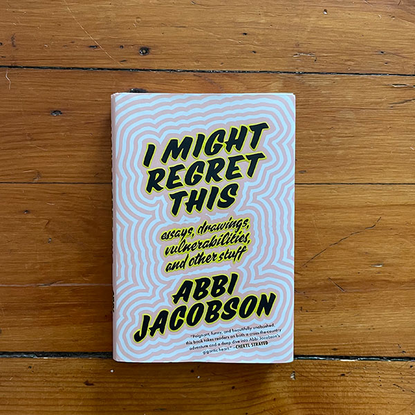
Book: I Might Regret This
Author: Abbi Jacobson
Jacket illustration: Andrew Brischler
Bold and meandering, the cover illustration by Andrew Brischler brings you into Jacobson’s world as she tells stories through a comedic and personal lens about traveling across the country alone after burnout and heartbreak. The book is also peppered with Jacobson’s own illustrations and doodles, further bringing you into her thoughts. Plus, Abbi Jacobson is simply the best and I am 100% biased in that I’ve loved her since Broad City was a web series.
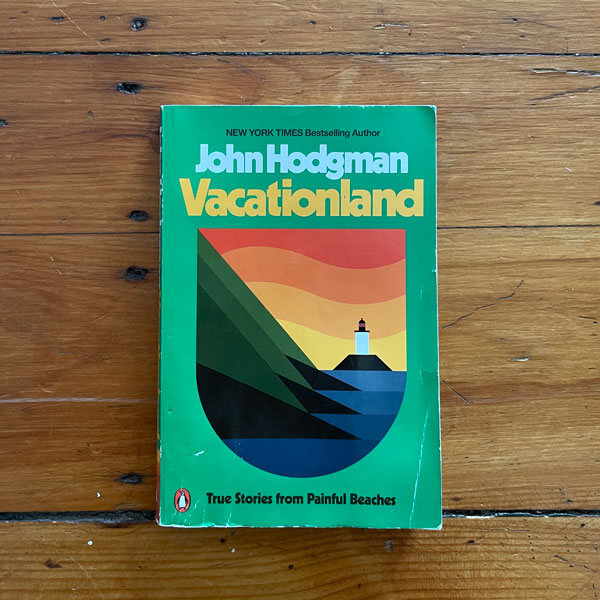
Book: Vacationland, True Stories from Painful Beaches
Author: John Hodgman
Jacket design and illustrations by Aaron James Draplin, Draplin Design Co.
I accidentally dropped this book into the water on a Maine beach and despite it being a paperback book, it survived. The simple and bold graphic of the lighthouse mirrors Hodgman’s quick and dry wit, and the color palette is indicative of the era that Hodgman was traveling around New England as a child. Bold, simple, nostalgic, to the point. The hardcover jacket is a different but equally as beautiful color palette.
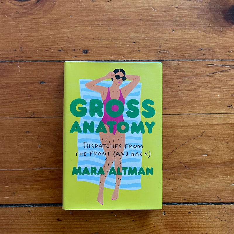
Book: Gross Anatomy
Author: Mara Altman
Jacket illustration by Leah Goren
To be honest, I haven’t yet finished this book. To be honest again, I bought it mostly because of the cover. Apparently I’m a sucker for bold illustrations, soft-touch covers, and books written by comedians. Mara Altman writes about her experiences growing up as a cis-gendered woman, and her relationship with her body as she makes peace with what society deems “gross.”

Book: The Road Not Taken
Author: Arnaud Montagard
Printed by Sentanta Books – a UK publisher specializing in photography books
This book is full of nostalgia and Americana that evokes the likes of 20th century painters Edward Hopper and Charles Sheeler. As a French photographer in America, Montagard’s voyeuristic and soft lens takes you through the states in photos that could have been taken any time in the past 50 years. The feel of this book is spectacular, a linen cover with a soft-touch photo simply set on the perfect shade of green. Sure, it’s literally a picture book, but it’s also one of my favorite things to look at.
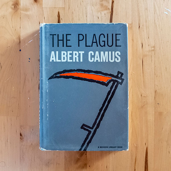
Book: The Plague
Author: Albert Camus
Although The Stranger is my favorite book by Camus, this version of The Plague (evidently from 1970ish) has the best cover of any Camus book. Just a simple iconic scythe and clean type. It also has some nostalgic appeal — this particular copy used to belong to my mother.
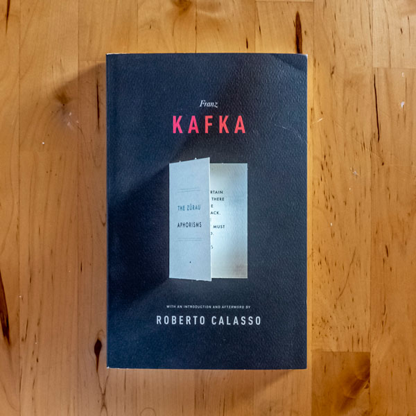
Book: The Zürau Aphorisms
Author: Franz Kafka
Jacket design by Peter Mendelsund
I keep this book at my desk, always. I frequently pick it up and read of few of Kafka’s powerful yet bewildering aphorisms. The cover design is very simple, but the die-cut flap which opens a sort of mini book cover to a sample aphorism is delightful and strange and maybe just a little Kafkaesque?

Book: The Hole
Author: Hiroko Oyamada
Jacket design by Janet Hansen
Cover photograph by Guy Henderieckx
This is a beautifully surreal tale that I thoroughly enjoyed. The cover art is simple, clean, and somehow manages to wrap the story in just the right feeling.
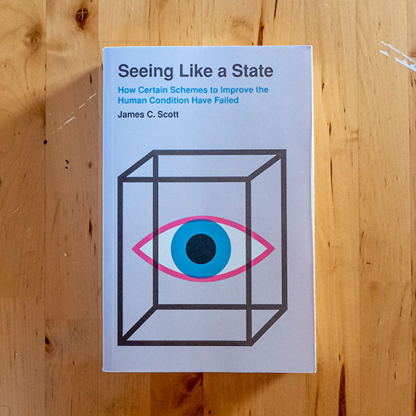
Book: Seeing Like A State
Author: James. C Scott
Designed by James J. Johnson
Cover illustration by Woody Harrington
This pure, laser-focused illustration speaks volumes. There is a timelessness to this aesthetic that I love. Purposeful layout, solid graphic elements – what more can one ask for? Also, I think everyone ever should read this book. Seriously, read it.
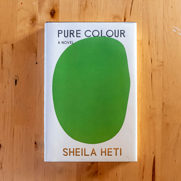
Book: Pure Colour
Author: Sheila Heti
Jacket design by Na Kim
Jacket painting: Green (Vert), by Ellsworth Kelly
Surprise, another minimalist cover design! I’m a sucker for the delicate nuances of just slightly organic minimalist forms (and, therefore, much of Ellsworth Kelly’s work). I also can’t ignore foil stamping. Oh, and the story is remarkable.
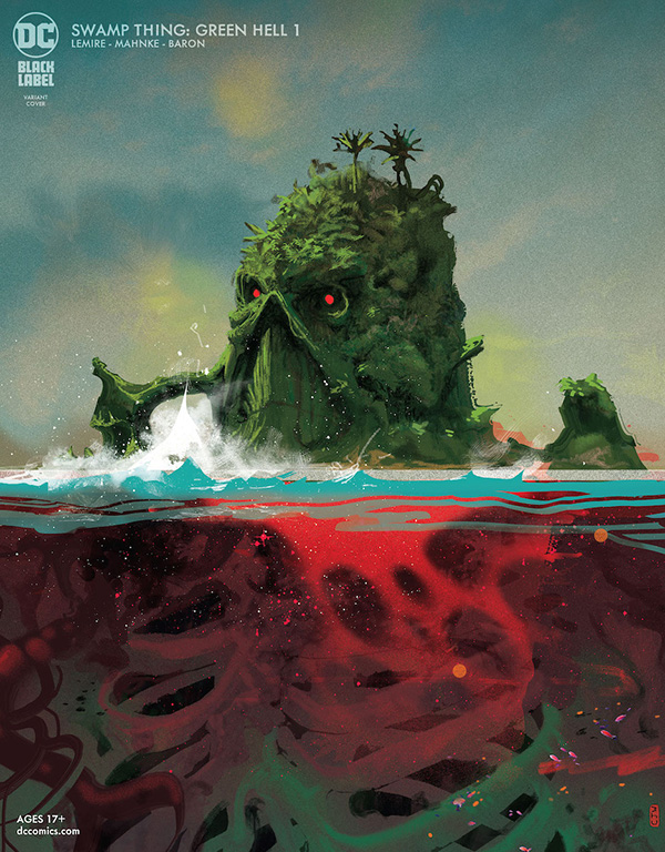
Book: Swamp Thing: Green Hell 1 by DC Comics
Artwork by Christian Ward and James Tynion IV
I’m a sucker for a good graphic novel and this new Swamp Thing series is just *chef’s kiss*. The combination of the illustration style and the color palette make this cover feel beautiful and terrifying at the same time. It feels like they gave the classic comic book art style a modern watercolor spin. I want this cover (and also all the illustrations inside) framed on my wall.

Book: Six Walks in the Footsteps of Henry David Thoreau
Author: Ben Shattuck
Artwork by Ben Shattuck
The cover of Six walks in the Footsteps of Henry David Thoreau has sun-printed ferns, flowers, and plants, which is a nice break from the popular digital, pixel perfect covers. Having the design done by hand gives it that natural and calming feel you get when you’re out walking in the woods. It feels much like a book of field notes and plant samples you’d be bringing back from the walks in the woods—it really puts you in the mindset of the author and Thoreau.
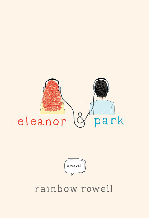
Book: Eleanor and Park
Author: Rainbow Rowell
Artwork by Harriet Russell
Eleanor and Park is sweet, funny, and emotional. The simple illustrations with the clean, open layout manage to capture the messages within the book without overcomplicating it.

Book: Finch
Author: Jeff Vandermeer
Artwork by Tyler Comrie
For some reason, Jeff Vandermeer’s books seem to be some of my favorites in terms of the cover art. Yes, the writing is great, but the art and cover layouts are so unique. The illustrative style of the mushrooms contrasted, plus the futuristic looking drips, plus the layout of the title—I was hooked before I knew what the book was about. His series, Reach, also has some wildly creative cover art.

Book: Poems to Live your Life By
Poems chosen and Illustrated by Chris Riddell
While shopping at a bookstore a few years ago, I bought a book by Neil Gaiman that was illustrated by Chris Riddell, a political cartoonist. I couldn’t help but wonder if I’m related to him in some way. Unlikely, but the fact that we share a surname made me want to research his work, and in doing so I found one of my favorite book designs. Poems to Live your Life By is a hardcover book containing a collection of poems paired with Chris’ illustrations. The intricate foil stamping on the cover gives the fantastical illustrations just a little sparkle. I’m not typically drawn to poetry, but the illustrations inside the book combined with the classic verses make me want to pick this up when I need a little escape.
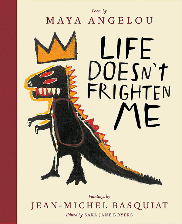
Book: Life Doesn’t Frighten Me
Maya Angelou and Jean-Michel Basquiat, edited by Sara Jane Boyers
A hardcover book featuring a poem written by an icon, paired with the artwork of a genius. Emotional and beautiful. I guess I love books that weave illustrations and stories together.
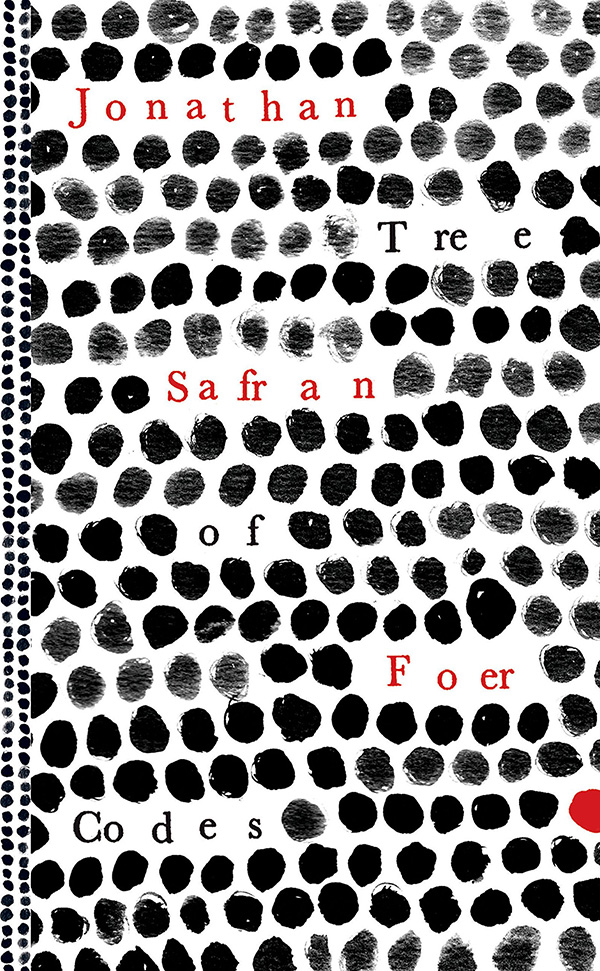

Book: Tree of Codes
Author: Jonathan Safran Foer
My husband purchased Jonathan Safran Foer’s Everything is Illuminated and I was immediately drawn to the cover with its bold, hand-drawn type taking up the entirety of the cover page (art by Anne Chalmers). Next up was Extremely Loud And Incredibly Close — another cover with hand-drawn typography that’s just as eye-catching. But then, Foer outdid himself with Tree of Codes. The author took his favorite book, The Street of Crocodiles by Bruno Schulz, and literally cut into the story, removing words to arrive at an original new story. I’ve never seen a book like this before. I admit I haven’t read it all the way through as it’s a challenge, almost like a puzzle…not to mention that the pages are delicate. But I love the whole idea behind it and the execution is amazing. I’m still scratching my head over how they could have mass-produced this book, but the results are mind-boggling.

Book: 7 1/2 Deaths of Evelyn Hardcastle by Stuart Turton
Cover Design: David Mann
This art deco immediately got my attention and then brought my eye to Clue-like objects wrapped around the cover. The only way to describe this book is to compare it to Groundhog Day, Gosford Park, and Quantum Leap and is one of my most recommended mystery books. There are so many twists and turns, you can reread it and it almost feels like the first time again.

Book: Pride and Prejudice by Jane Austen
Cover Design: Jessica Hische
I’m obsessed with all of the Barnes & Noble Classics that Jessica Hische redesigned, they’re a perfect balance of illustration and letterwork. There are so many covers to look through, but Pride and Prejudice is a classic I keep coming back to.

Book: Neverwhere by Neil Gaiman
Cover Design: Henry Sene Yee
It’s so hard to choose just one, but the simplicity of the staircase for Neverwhere keeps drawing me in. Henry Sene Yee’s watercolors are so gorgeous to look at and take a lot of self restraint to not go out and replace some of my books with these new pieces of art! Check out more of the reissued covers here.

Book: Dead Eleven by Jimmy Juliano
Cover Design: Alex Robbins
As a Stephen King junkie, seeing this cover reminded me of all of his classic paperbacks. This author’s debut novel is set on an isolated island in Lake Michigan where everyone is stuck re-enacting one specific day in 1994. There’s plenty of 90s tech nostalgia, hence the VHS tape on the cover, with some horror/mystery elements thrown in too.